

A digital overhaul for Vancouver's destination ski resort.
The famous skiing resort and #1 attraction in BC's Lower Mainland came to us with a website that was in need of improvements. Together, we rethought and redesigned the entire online experience—is it any coincidence that Grouse Mountain went on to have its best year on record?


Our method.
The Jibe and Grouse Mountain have now been working together for over six years. This ongoing relationship of trust allows for an open communication that helps us both to seize new opportunities and tunnel through obstacles.
The redesign of grousemountain.com took this collaboration to a whole new level. Our flexible approach enabled us to integrate all our client’s goals and make iterative changes throughout the digital overhaul. It also afforded us the chance to innovate and dramatically improve the customer experience.
As with all projects, we worked closely with the Grouse Mountain team to address the highest impact objectives by priority, whether technological or business, effectively ensuring the best value possible.


Top Challenges

- Modernize the design
- Restructure the layout the interface
- Improve the user experience on mobile devices
- Update and build upon inefficient legacy code
- Create greater fluidity between the online and offline user experience
Top Solutions

- Created an entirely new aesthetic supported by inspiring photography and graphic visuals
- Reevaluated every corner of the information architecture for streamlined navigation
- Reverse-engineered legacy code for congruency, significantly increasing stability, security and speed
- Launched a mobile-responsive design and fast checkout option to improve the user experience and increase eCommerce conversion
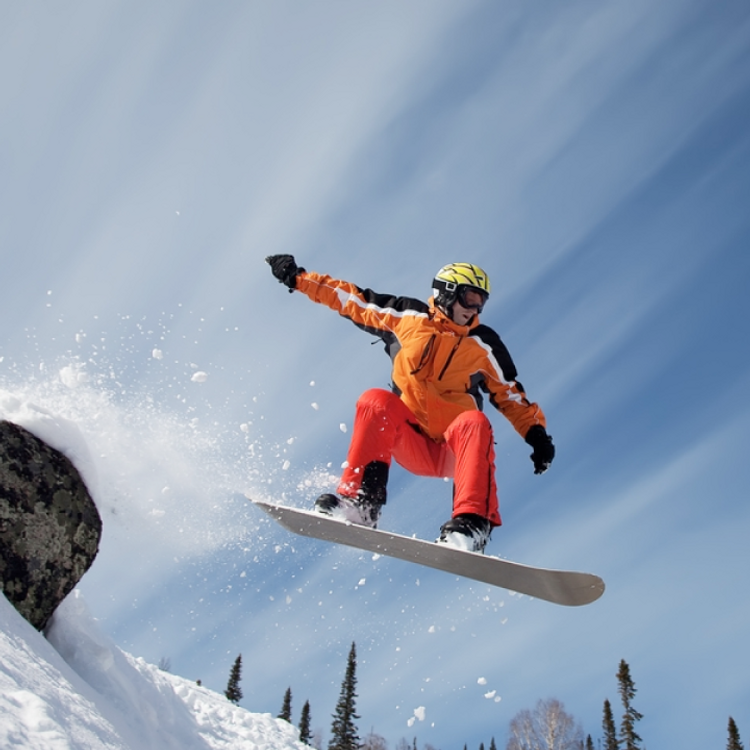
A beautiful experience. Naturally.
Grouse Mountain sees the same typical guest types: locals and tourists who want information on winter activities, and locals and tourists who want information on summer activities. Our goal was to delight them all without alienating any.
Taking advantage of the natural beauty of the Mountain and the spectacular activities offered by the resort, our new design walks the line between inspirational and practical. Finding key information should never dampen your exhilaration about visiting these snowy peaks! Before our redesign, the website showed only winter activities in winter and summer activities in summer. This could be frustrating for visitors planning their visits in advance.
The current site now caters to everyone by allowing the guests to pick the season they want to see. Setting the site’s default season is fully in the hands the Grouse Mountain marketing team.
Increased usability.
The site’s old menu structure posed many challenges. Common with large and enduring websites, the site navigation had expanded alongside the website, lacking a concurrent unifier that accounted for new and old sections alike.
Revisiting the navigation involved restructuring the menu items from the ground up. Not satisfied with guesswork, we collected data from detailed content audits and real user testing to determine concretely how people think about the content categories and search for information.
Speed up everything.
As part of a series of ongoing improvements parallel to the site redesign, we launched a new fast checkout option with mobile counterpart, and this, during the holiday season. While it may not have been an optimal time to do so (in so many ways!), our adaptability and performance under pressure helped us release this key addition in time for Christmas.
Even today, customers can purchase tickets from their phones in as few steps as possible. Not only did this reduce physical ticket booth lineups during peak times, but it also improved overall customer satisfaction.
While checkout speed is a cornerstone in eCommerce success, you don’t want to neglect the speed of the rest of your site either. Working with our friends at IONICA, we optimized the page loading times for the entire site, increasing performance by over 50% on both mobile and desktop devices. Reaching the 1-2s range, we achieved a score of 99% for our Apdex (Application Performance Index), an industry standard to measure users' satisfaction with the response time of websites.
The space between.
So much of a business’s success lies in the spaces between. Especially with digital transactions, the tiny details in a site’s design can add up to make an enormous impact. Our work with Grouse Mountain was mainly addressing the little things that the customers wanted, and then building something more congruent with modern expectations, and those little changes paid off big.